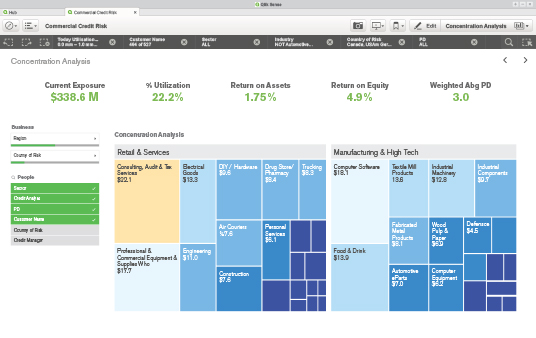
Qlik released their next generation self-service data visualization software called Qlik Sense sometime in September 2014, but had users wanting more as the initial version of the tool lacked finesse. There were lots of bugs and some of the most common features expected by users were missing. For example, the coveted pivot tables were missing and the only question on everyone’s mind was, “How could they have a BI tool without pivot tables?”
However, as Qlik promised, it was just a matter of time and last month with the release of Qlik Sense 1.1 they added many in-demand features to the tool to make it more robust and ready for the consumers.

In this post, I highlight a few key features and upgrades to Qlik Sense.
1. Pivot Table
Pivot tables are one of the most important visualization objects for any data visualization tool and this was missing in the first release of Qlik Sense. In my opinion, addition of pivot tables is the most important update in Qlik Sense 1.1.
The Qlik Sense pivot table object allows you to add one or more dimensions and expressions to the table. Users can easily arrange the position of the dimensions as primary and secondary dimensions.
We can also set the dimension limits.
Another cool feature is that it allows for associative selections and direct search on dimensions in the table.
2. Date and Time Fields
Qlik Sense also adds the ability to create date and time fields.
It introduces the Declare and Derive statements that makes it a breeze to create a calendar definition. This calendar can be used for all date fields in your app. These fields are called derived fields; they are not visible in data model viewer, but are defined by a calendar template in the data load script.
3. New KPI Object
Often, customers need to summarize the key metrics in the BI dashboards. Traditionally, we all have used text and image objects to represent such summary. Qlik realized it and created a new type of visualization called KPI object that makes tracking of performance metrics super simple.
The KPI object allows you to add a main metric along with an optional secondary measure which can be used for displaying comparative figures.
The object has nice styling options including conditional colors with custom defined thresholds, trending arrows, etc.
4. Map improvement and Snapshots of maps
Qlik Sense also made lots of improvements to the mapping capabilities.
They’ve tied up with MapBox that provides comprehensive yet simple mapping.
If you want to use any other mapping service, you can configure that too.
Maps can now also be included in storytelling and you can also take snapshots of the maps.
Below are a few more minor but important features added to Qlik Sense 1.1.


